Case study
Thriva: giving customers clarity on what to do after a blood test
Thriva helps people take control of their health through self-administered blood testing. My focus was the post-results experience: helping customers understand what their results mean and what to do about them.
The problem
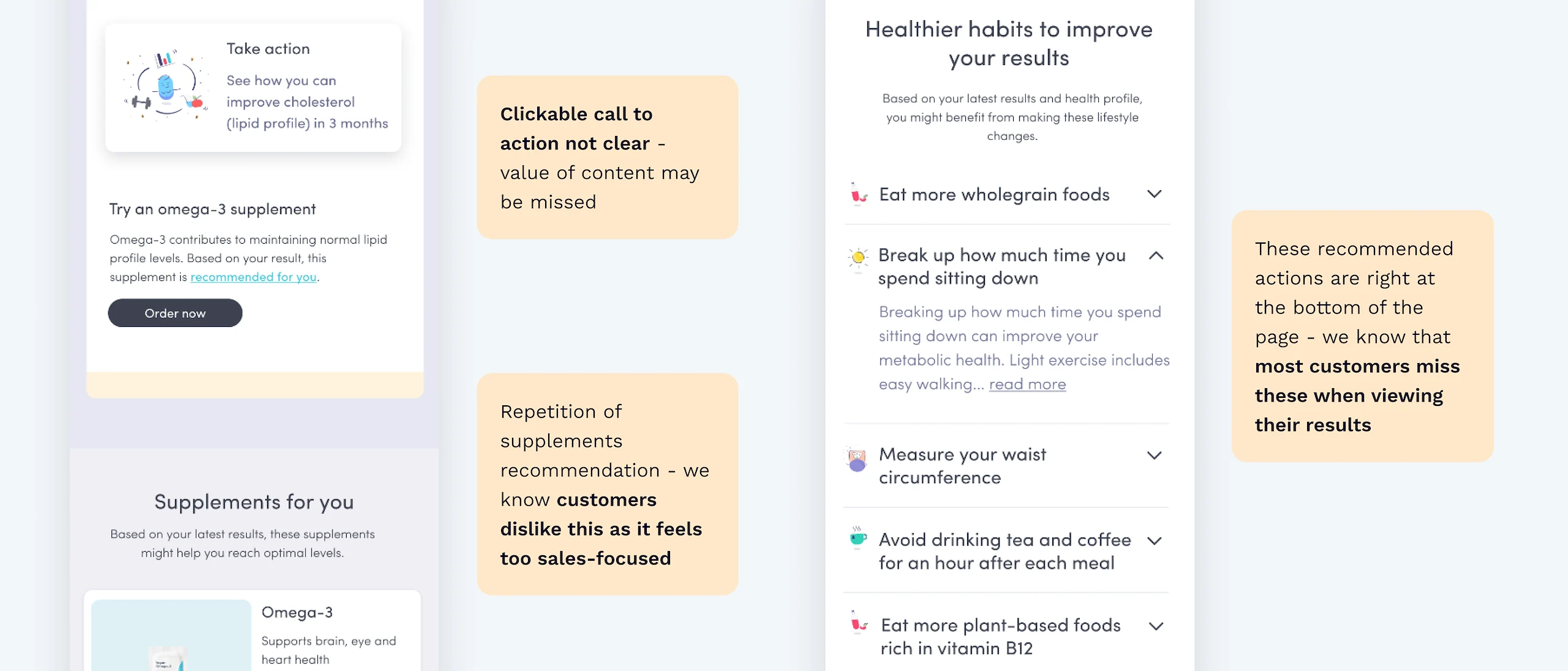
Working with a Content Designer, User Researcher and Product Manager, we identified four high-level retention challenges customers faced after testing. We chose to focus on the sharpest one: it's unclear what to do after a set of blood test results, and prioritised the mobile app, where most customers actually view their results.
Process
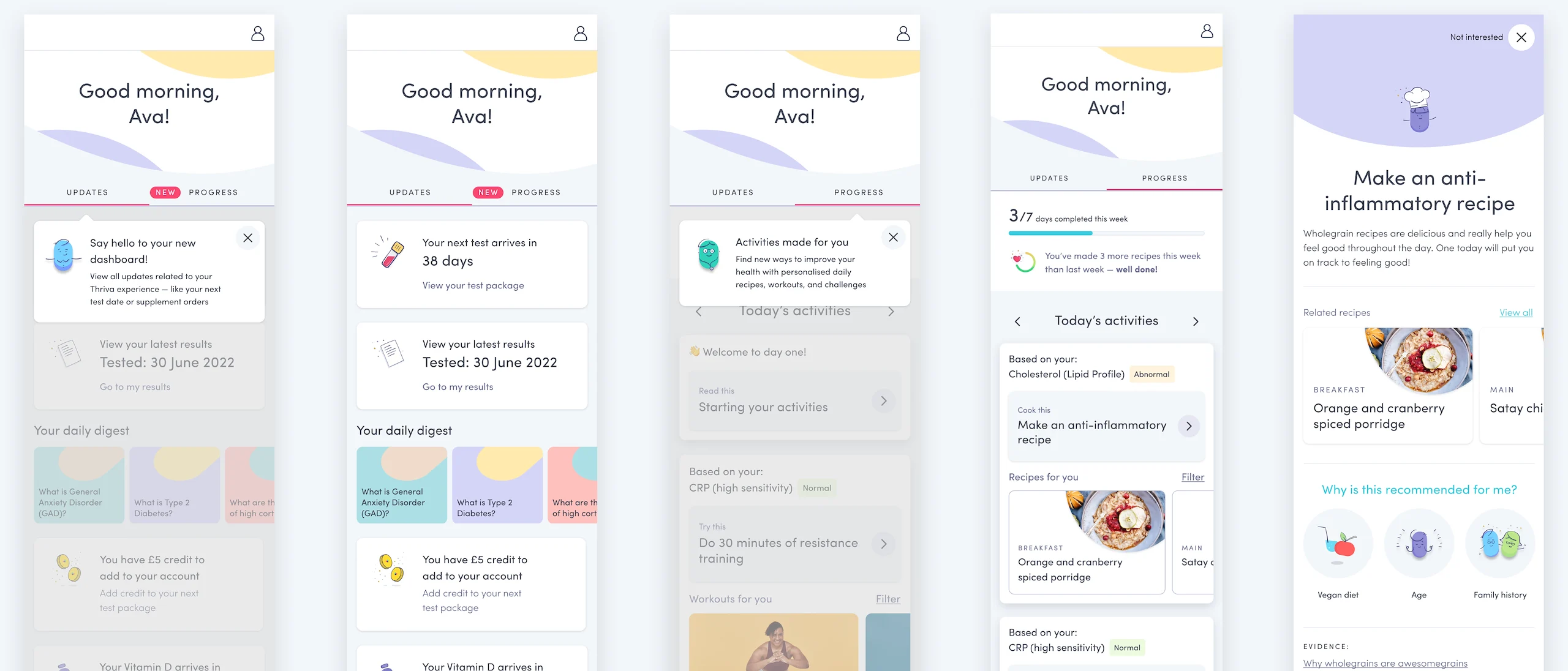
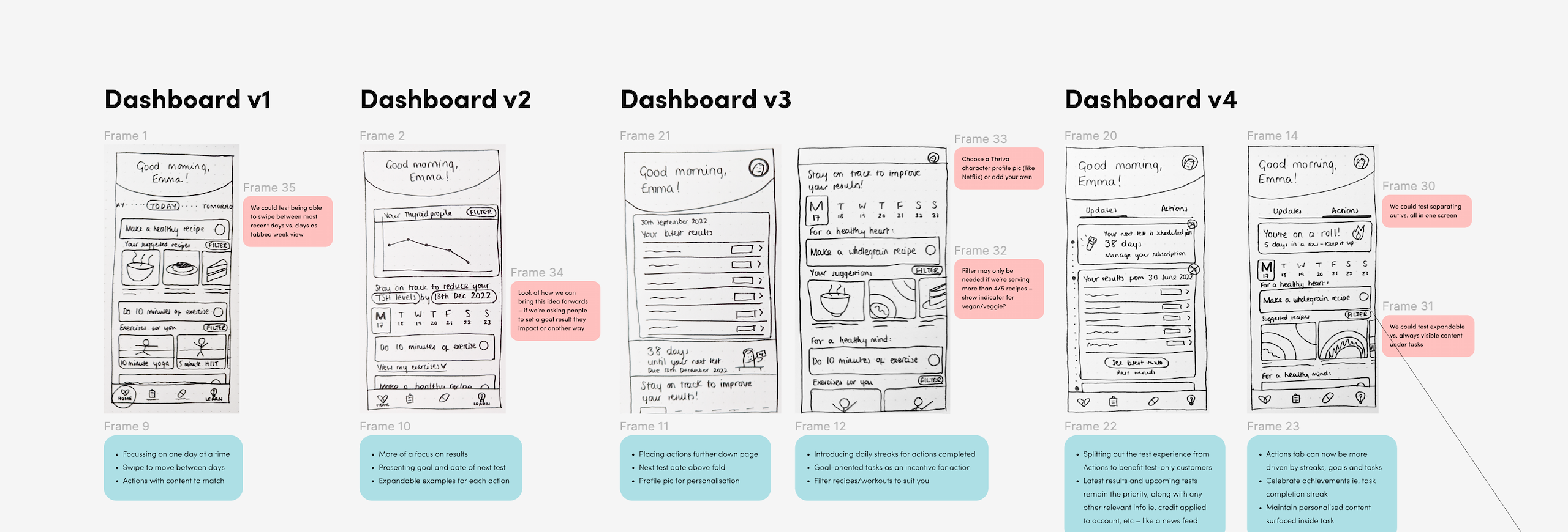
Testing. We shaped two "how might we" statements (encourage daily app returns, and present next steps clearly and actionably), then validated three hypotheses through unmoderated testing on UserTesting.com:
- A dedicated "Progress" tab makes it clearer where to take action
- Marking activities as complete increases motivation
- Daily "streak" incentives encourage customers to come back
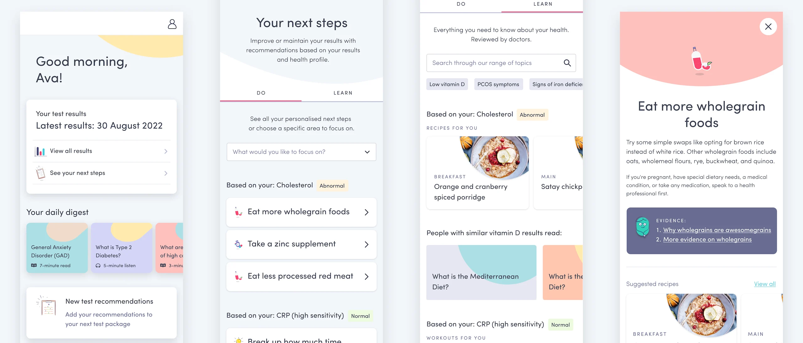
All three held up. Interviews. From there we simplified activity cards, explored alternative naming for the progress tab, added motivational messaging, let customers complete tasks without pop-ups, and limited the updates tab to avoid overwhelming people. Follow-up interviews surfaced more nuance: customers liked a collapsed results component for quick access, but there wasn't enough visual distinction between "Do" and "Learn" content, and people wanted a stronger link between a recommendation and the result it came from.
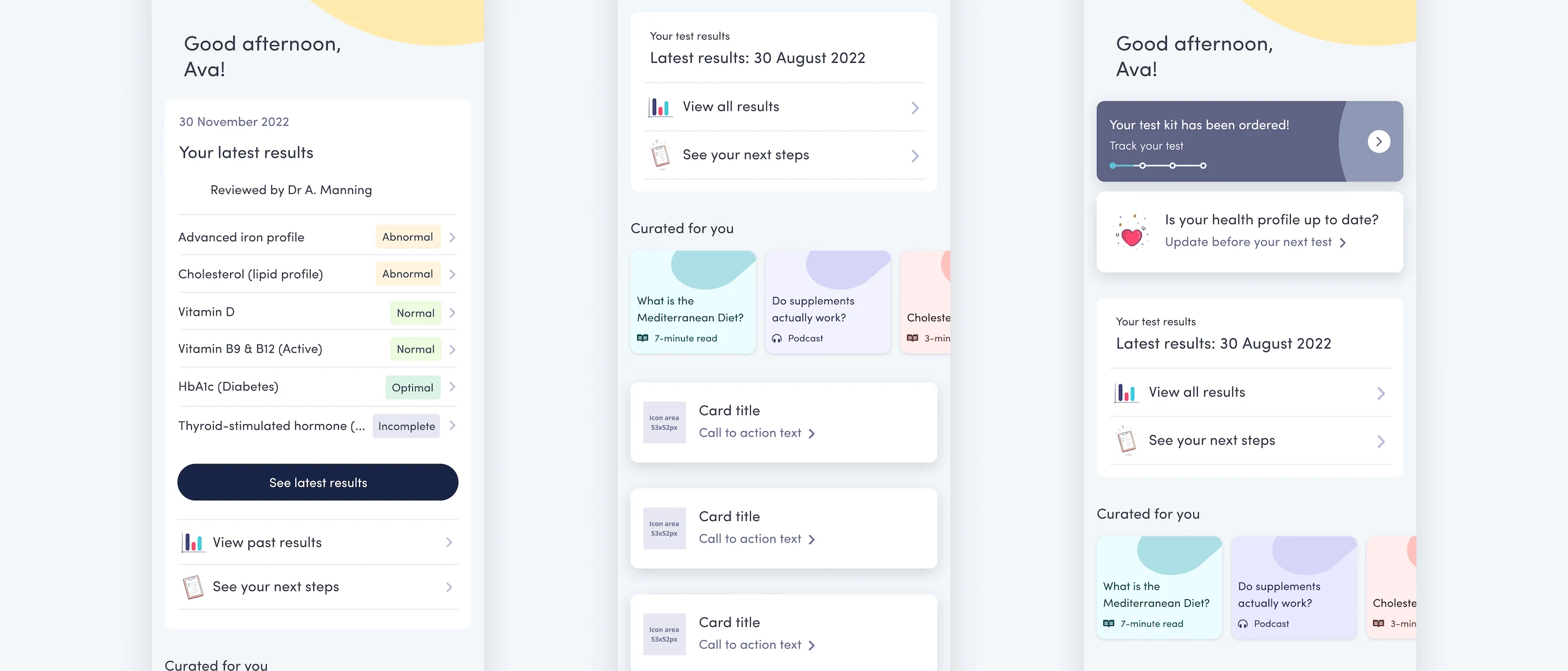
"It tells you everything that you need in that box up there. I guess it draws your attention more to your results."
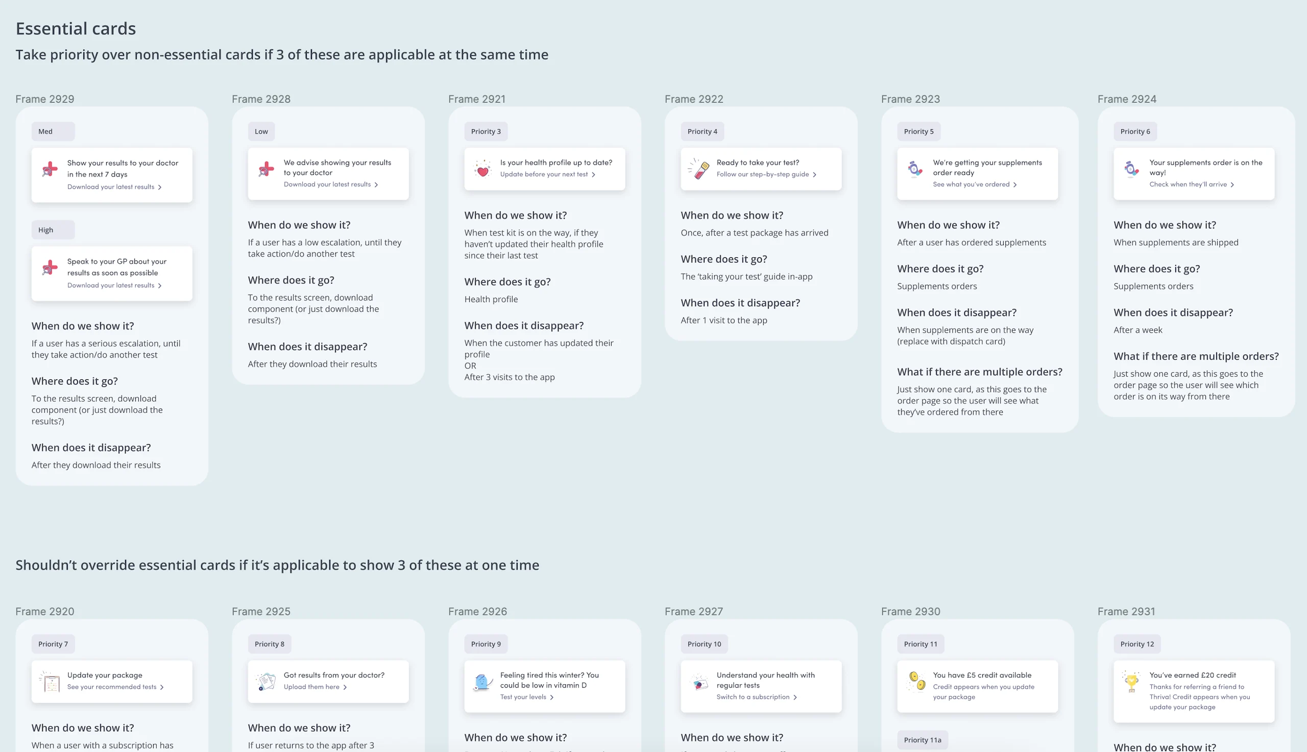
Build, with a pivot. As business priorities shifted, we refocused on surfacing relevant actions directly on the app homepage: timely action cards tailored to different points in a customer's journey, capped at three at a time so nothing felt overwhelming.
Outcome
The full "next steps" redesign was deferred, but the underlying insight didn't go to waste: it was folded into a membership offering that launched six months later, alongside the homepage and results-component improvements we'd already validated. Detailed performance metrics weren't available due to a shift in Data team resourcing, but the qualitative signal was clear: customers left each round of testing with a better sense of what to do next.