Case study
The Lowdown: turning a blog into a health hub people can trust
The Lowdown had hundreds of pieces of doctor-reviewed health content sitting in a standard WordPress blog, with scrolling as the only way to find any of it. I rebuilt it into a searchable health hub, with topic landing pages, answer-first articles and visible medical credibility throughout.
The problem
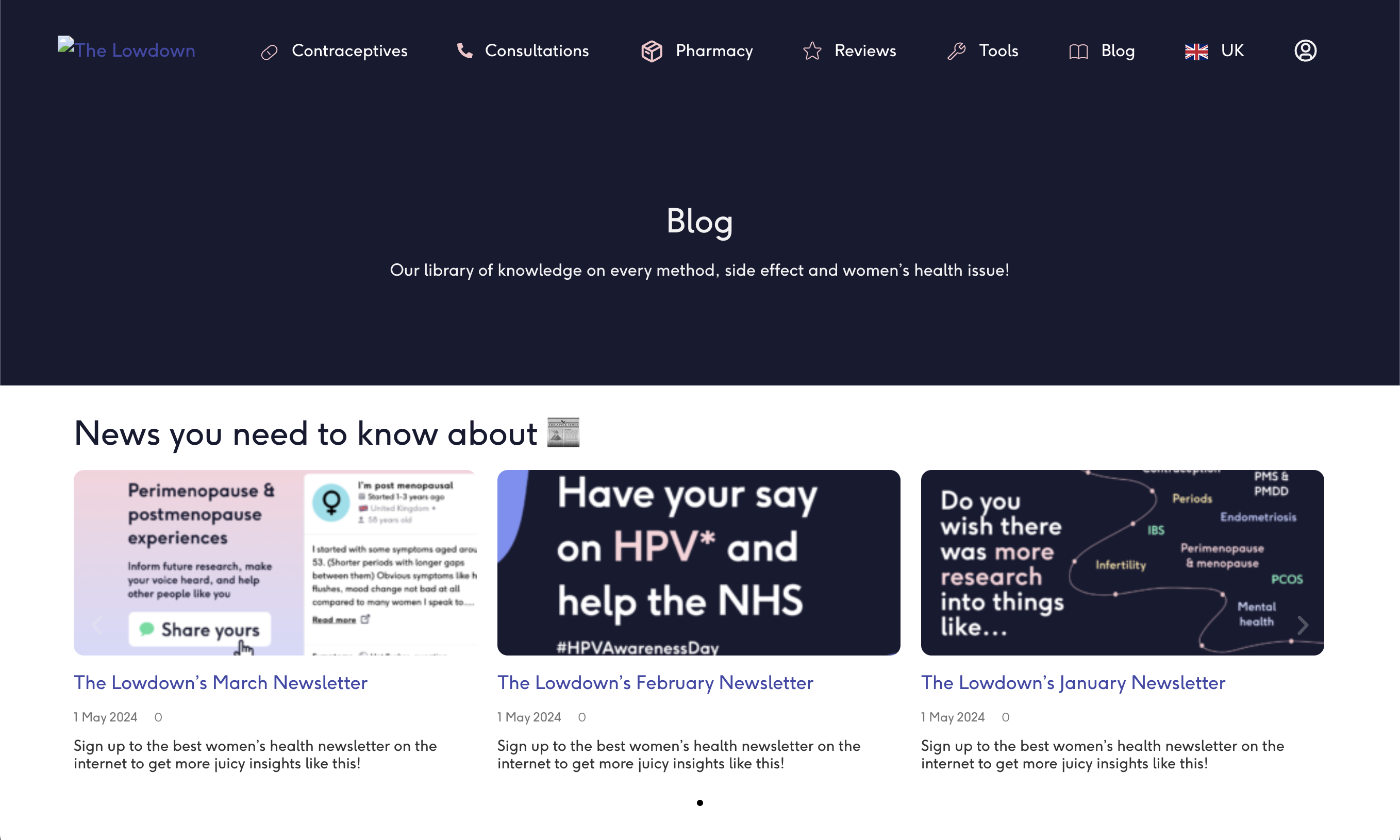
The old blog worked, but it didn't help anyone find an answer. It was a stock WordPress index: a dark banner, a newsletter carousel, then posts in the order they happened to be published. It carried the brand, but it didn't do a job.
- Purely functional. The layout carried the brand but gave readers no route through the content beyond scrolling.
- No search, no categories. Hundreds of pieces of reviewed medical writing, with one way in: if you didn't already know an article's title, you weren't going to find it.
- Long reads, no shortcuts. Articles ran to thousands of words with no anchor links, so someone arriving with one specific question had to read everything to find the paragraph that answered it.
- Credibility was invisible. No visible credentials, no review date, no explanation of who checks the facts. In an age of AI-written health content, that signal is the product.
- The article started below the fold. Hero image, author block and share links stacked up first, pushing the thing you came for off screen, worst of all on a phone.
Process
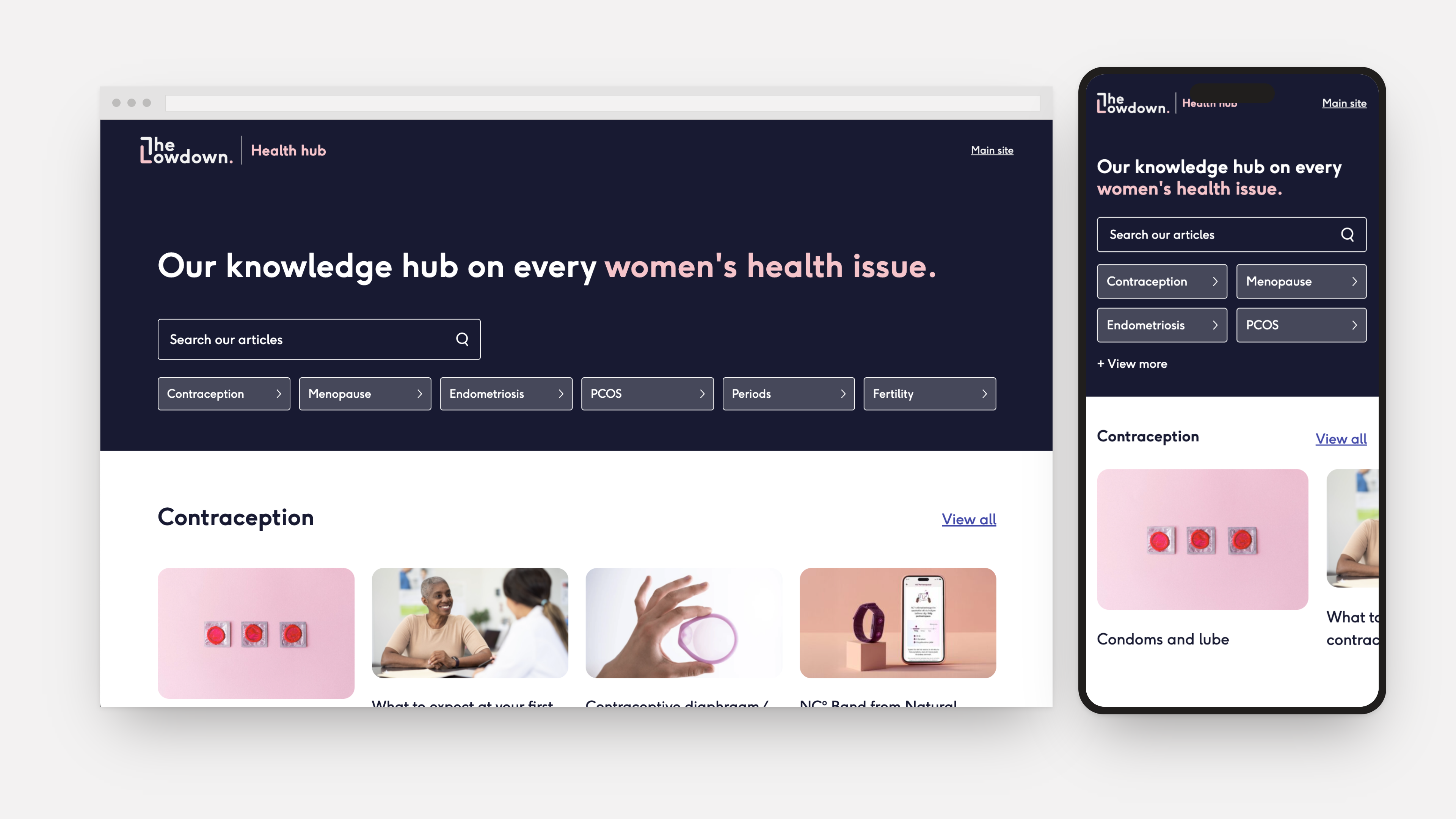
Findability. The first thing on the new hub is a search field. Below it sit six topic doors, covering the health issues people actually arrive looking for.
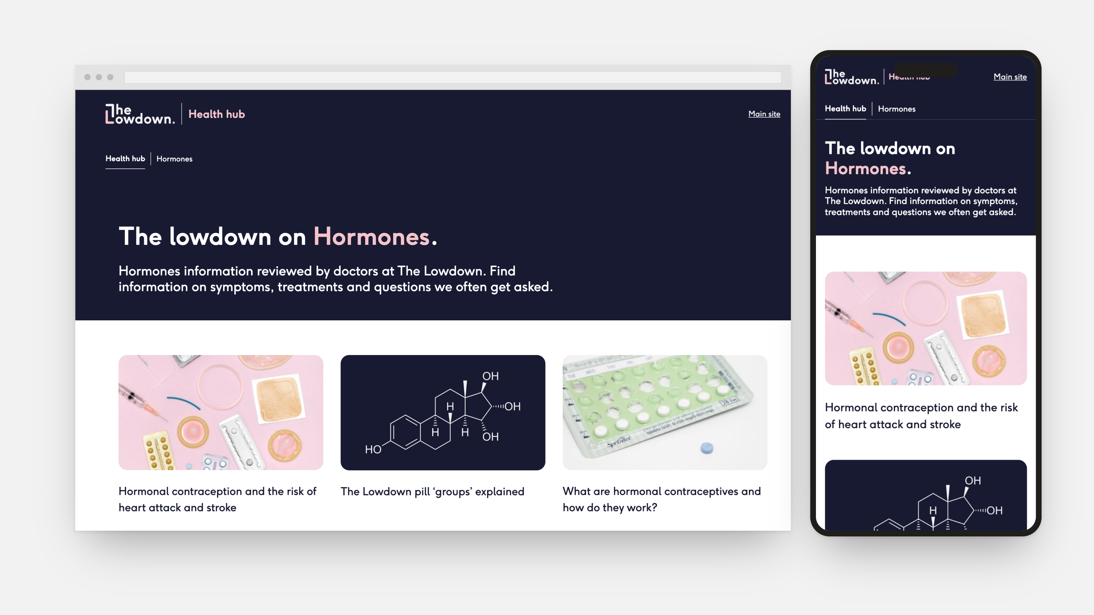
Structure. Contraception, menopause, endometriosis, PCOS, periods and fertility each got their own landing page, styled and worded to read like an intentional guide rather than a tag archive, with a clear "reviewed by doctors at The Lowdown" promise, so search traffic lands somewhere that answers the question rather than on page four of a feed.
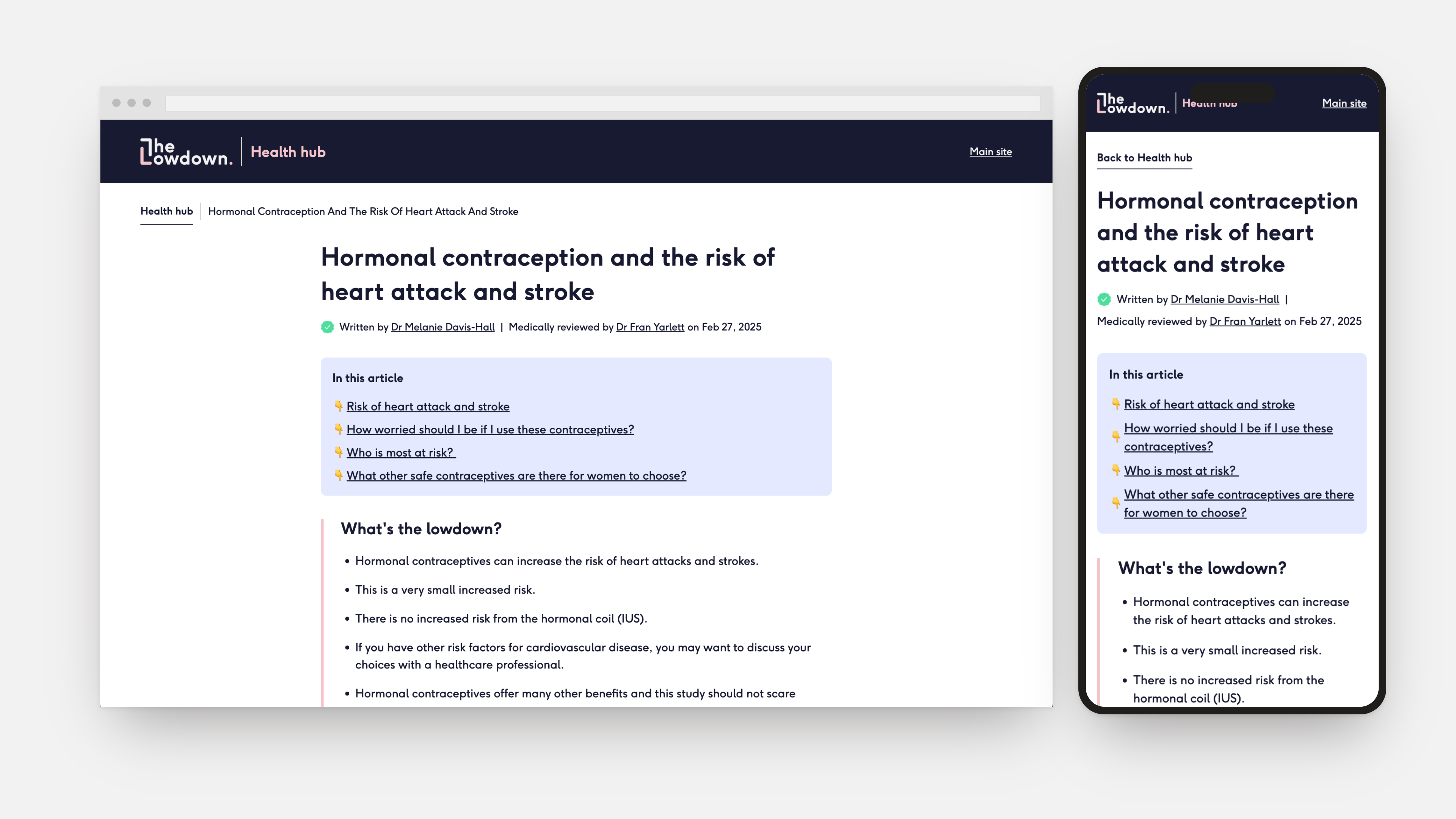
Scannability. Every article now opens with its own "in this article" jump links, so someone arriving with a specific question can go straight to the relevant section and skip the rest without guilt. The hero image, share row and author bio all moved out of the way.
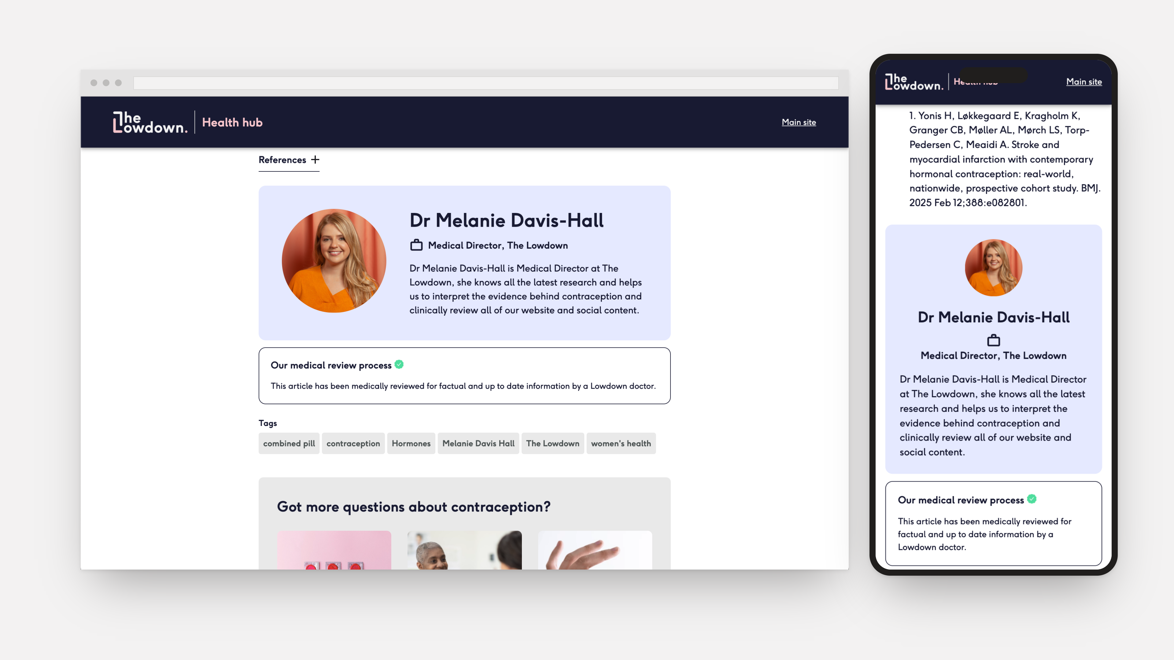
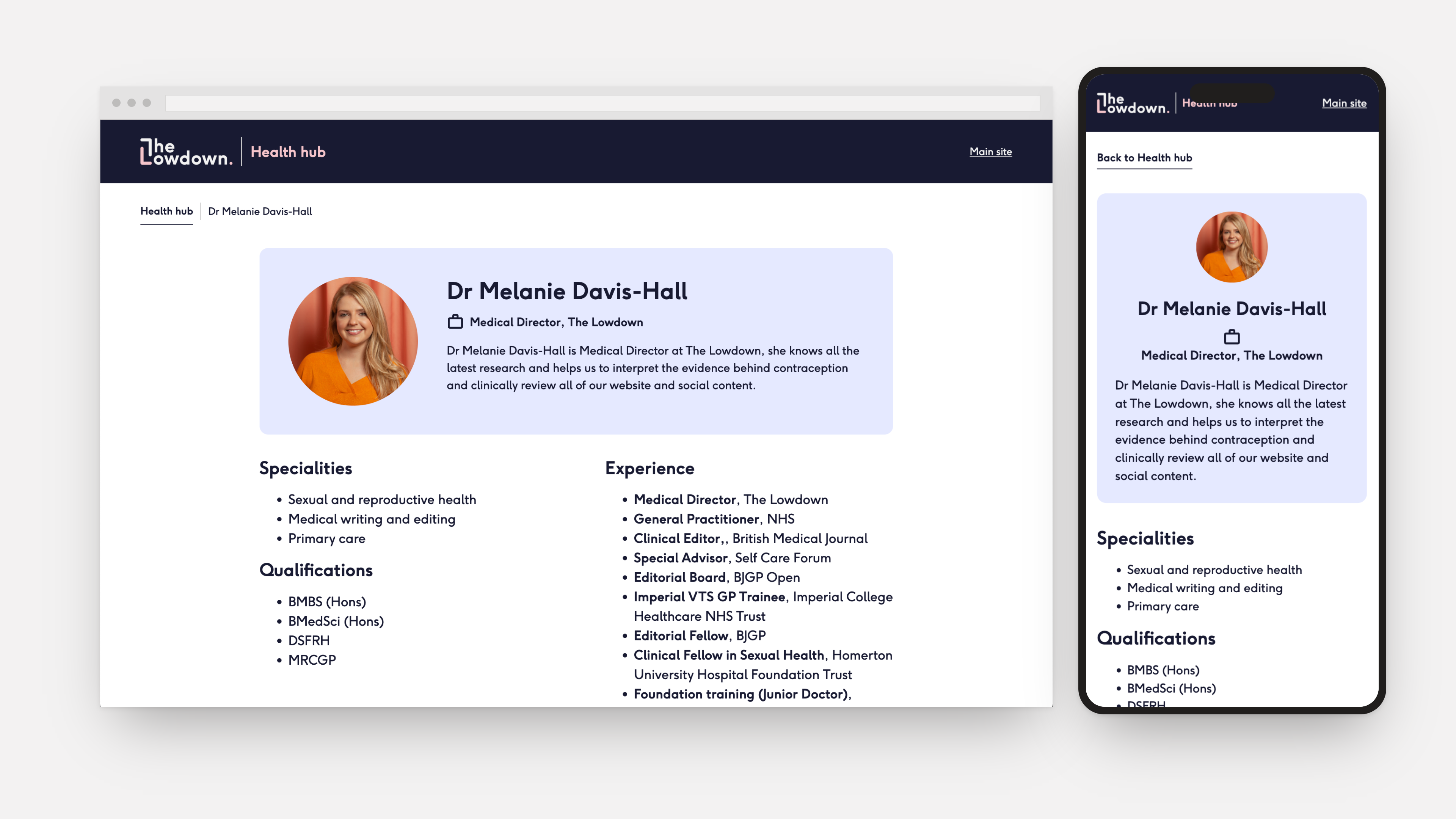
Trust. A green check, who wrote the piece, who medically reviewed it and when, plus a linked author profile with real qualifications and a plain description of the review process: the credibility signals now sit where a reader needs them, at the point they finish reading.
Outcome
The hub is live as I designed it today. What started as a single reverse-chronological index in April 2024 is now a proper library, built for searching and scanning rather than scrolling. So nobody googling their symptoms at midnight has to look harder than they should.