Case study
Béa Fertility: rebuilding for the rebrand
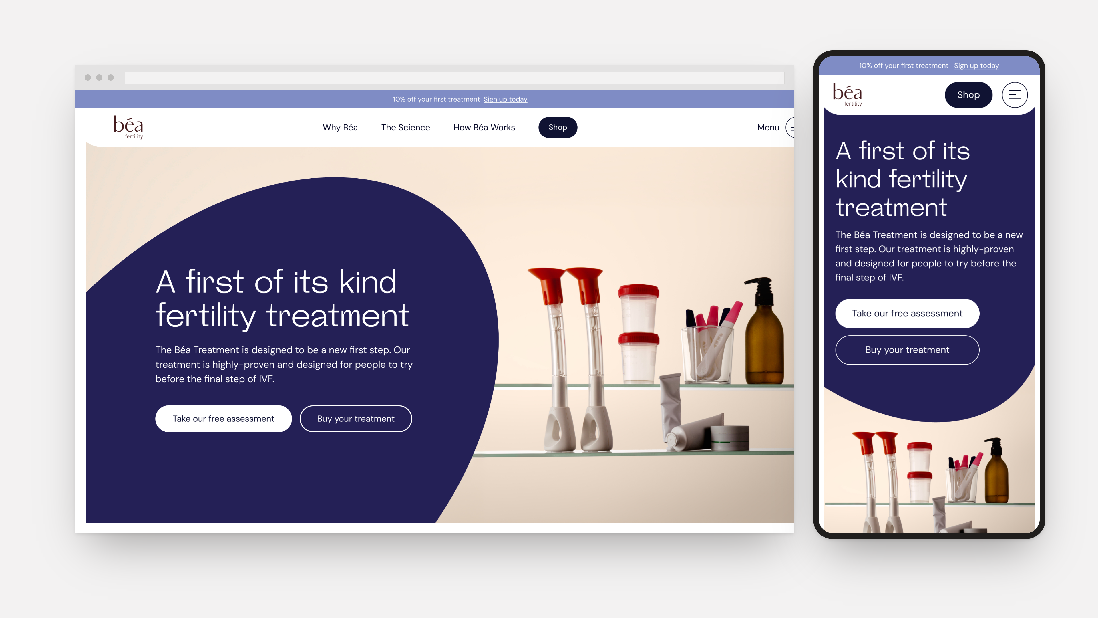
Béa Fertility came to me off the back of a full company rebrand, needing their Shopify website rebuilt to match. The brief went beyond reskinning a few templates: it had to make sure the new brand would still look like the new brand six months, a year, three years down the line, long after I'd handed the project over.
The problem
A rebrand only survives if the people managing the website day to day can actually keep it consistent. Béa didn't have a permanent designer on their team, so every new landing page, product page, or campaign page after launch would be built themselves, inside Shopify, under time pressure, with no one checking that spacing, colour, or layout still matched the brand.
The real job was to design a system that makes it hard to get the brand wrong, and makes everyone's lives easier: one of my main aims with any client!
The system
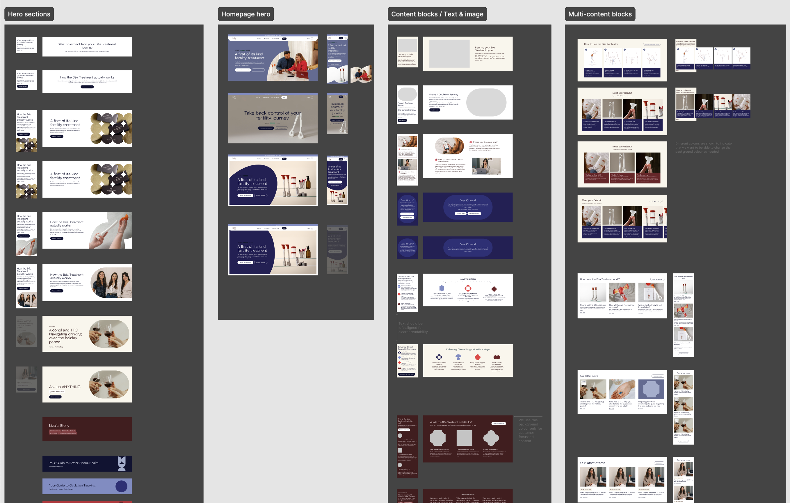
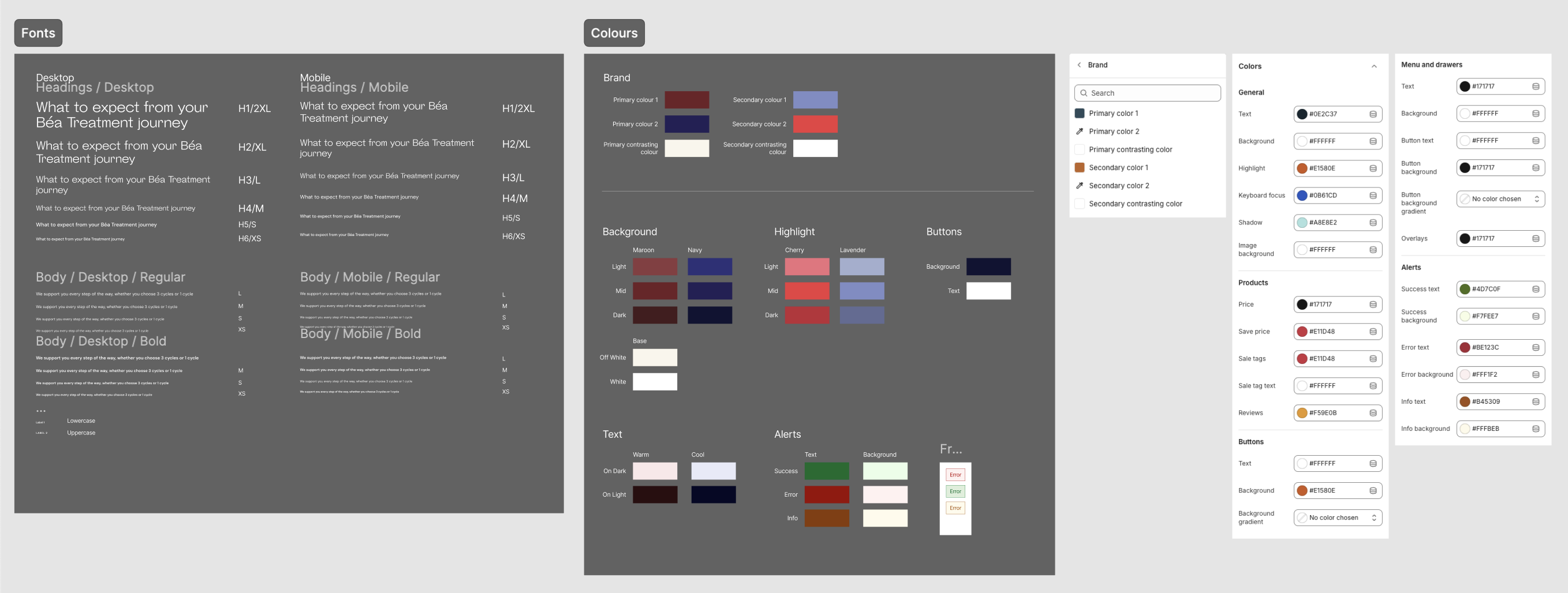
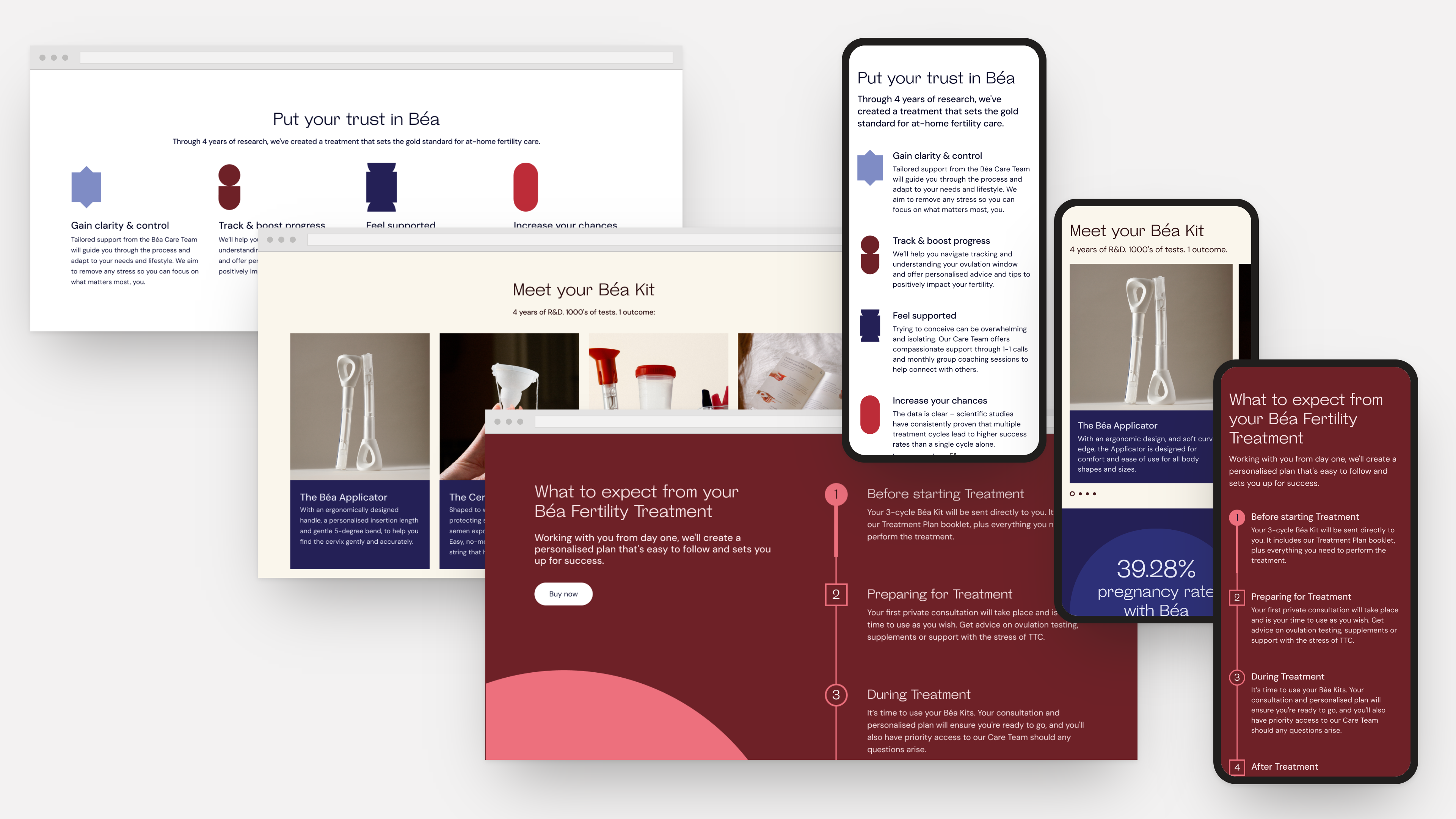
Rather than designing pages first, I designed a library of reusable blocks: hero sections, content and text/image blocks, and multi-content blocks like product grids and card carousels, each with a set of on-brand variants built in, so the team always has a safe option no matter what a page needs. I provided examples of full-page structures too, to make it clear which blocks paired well with which.
Product offering redesign
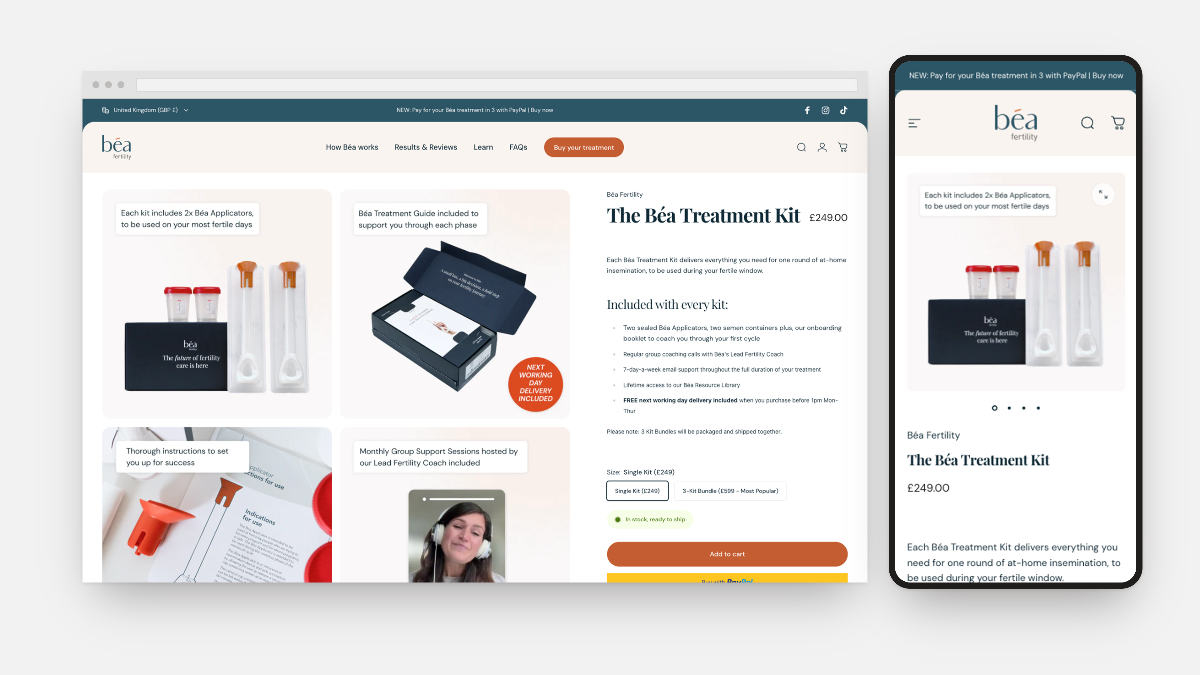
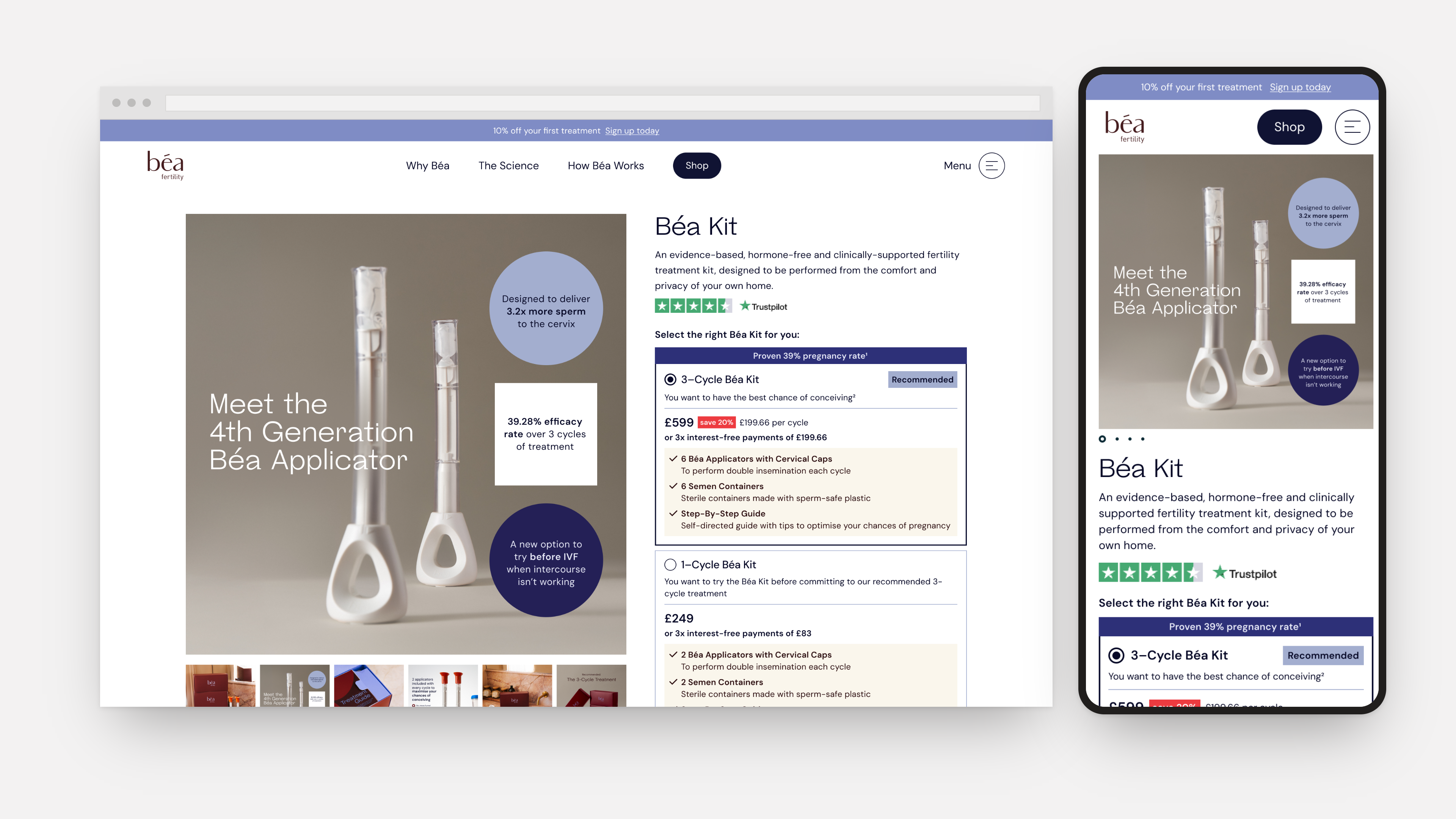
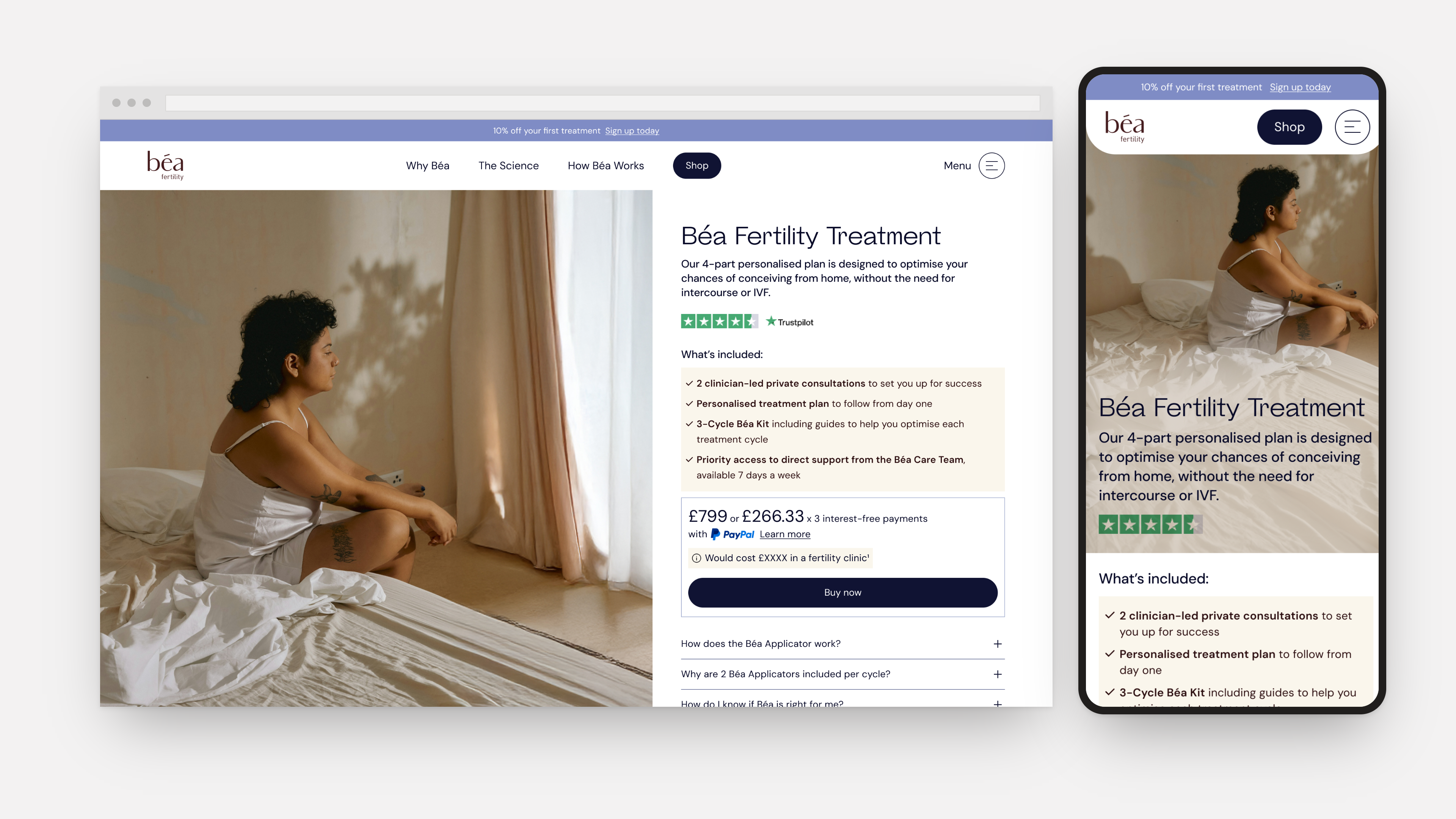
In addition to the rebrand, Béa changed their offering, splitting one product into two: a lower-commitment, self-serve Kit, and a higher-touch Full Treatment programme with clinician support.
The most complex challenge here was how to position the two offerings as recognisably 'Béa', whilst also communicating the many different product features and the differences between them.
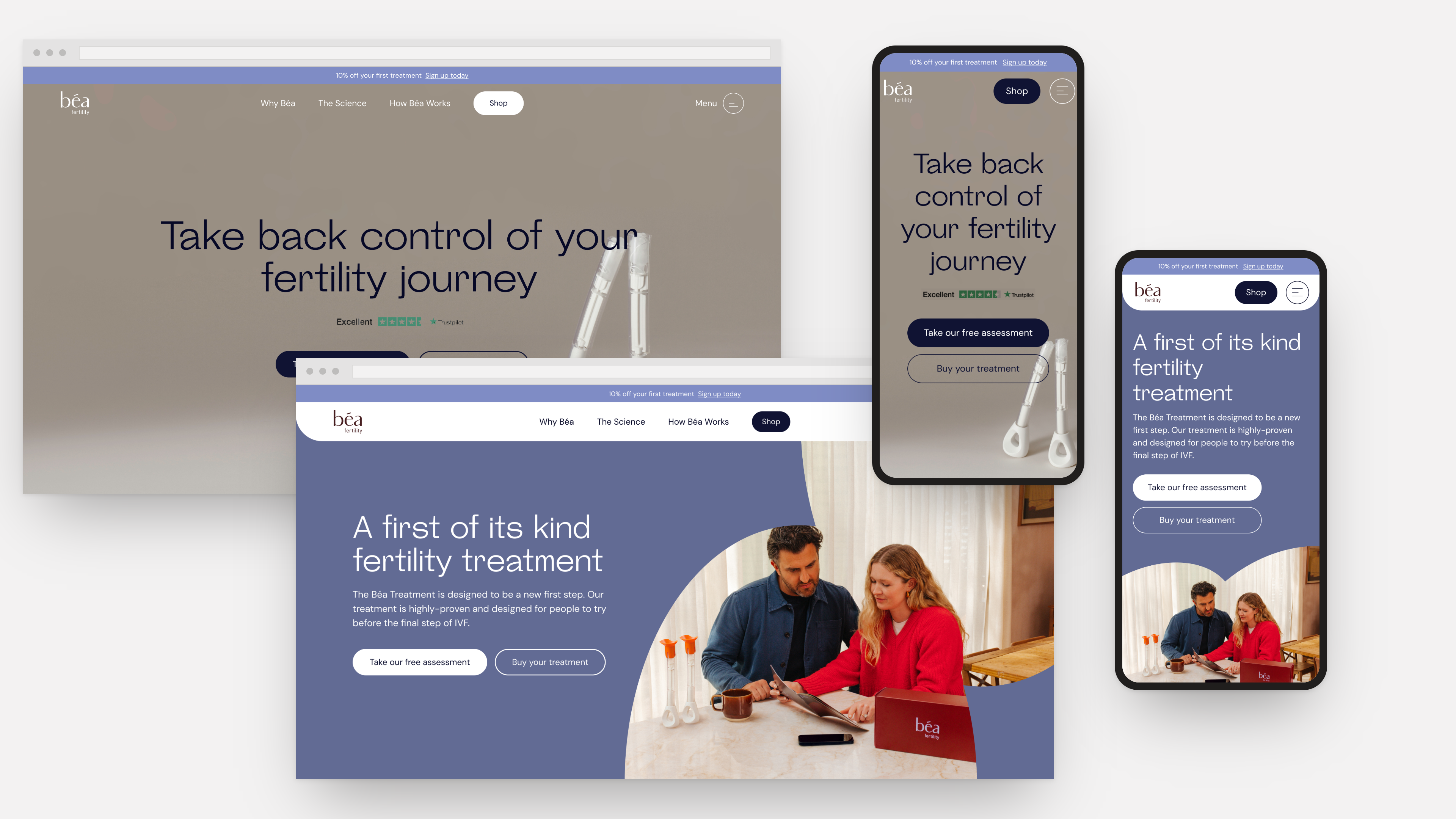
Homepage hero redesign
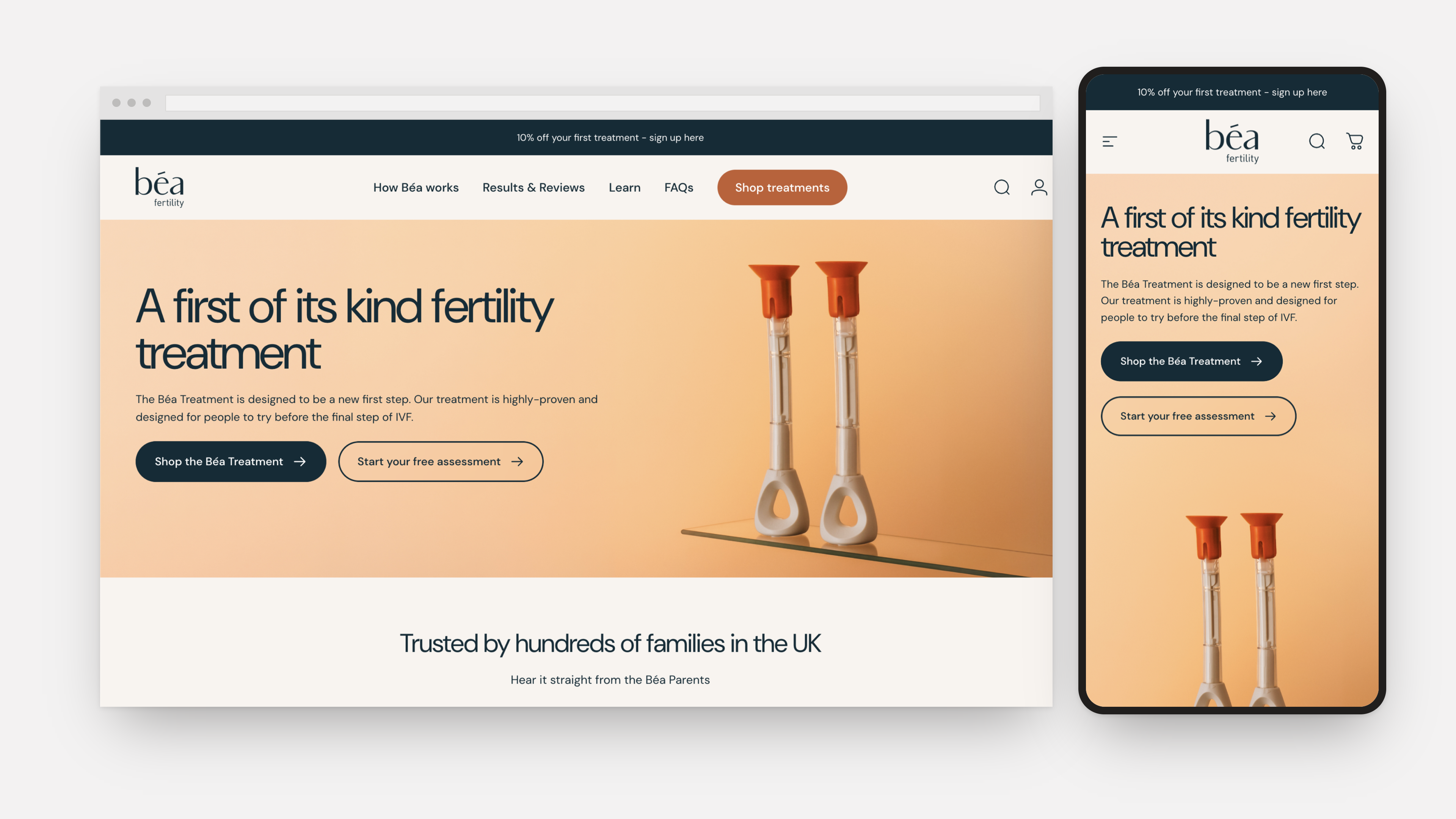
The homepage hero shows the same shift at a smaller scale. The old version used a generic layout with little brand personality, while the new one leans into brand colour, shapes and imagery, built within the same reusable hero block and its headline and call-to-action structure.
Working with development
None of this holds up if it's hard to build or hard to edit. I worked closely with Béa Fertility's developer through the whole process, reviewing how each component would actually get built in Shopify, and where the line sat between "this should be editable in the page builder" and "this should be locked down in code."
That back-and-forth shaped a lot of the final component structure. Some variants I'd designed as separate components got merged into a single component with editable fields, because it was simpler for the developer to build and simpler for the team to use later. Others stayed as distinct components because giving them shared settings would have made it too easy to combine them in ways that looked broken.
Outcomes
The result is a Shopify site that looks like Béa Fertility's new brand today, and a system built to keep looking that way. The team builds new pages from existing, on-brand components rather than a blank canvas, and the developer maintains a small, well-defined set of blocks rather than a sprawling one-off build.